A/B Testing

How It Works

AB testing is quantitative research method used to compare two versions of a web page or app interface to determine which one performs better.

Stage

3.2

Method

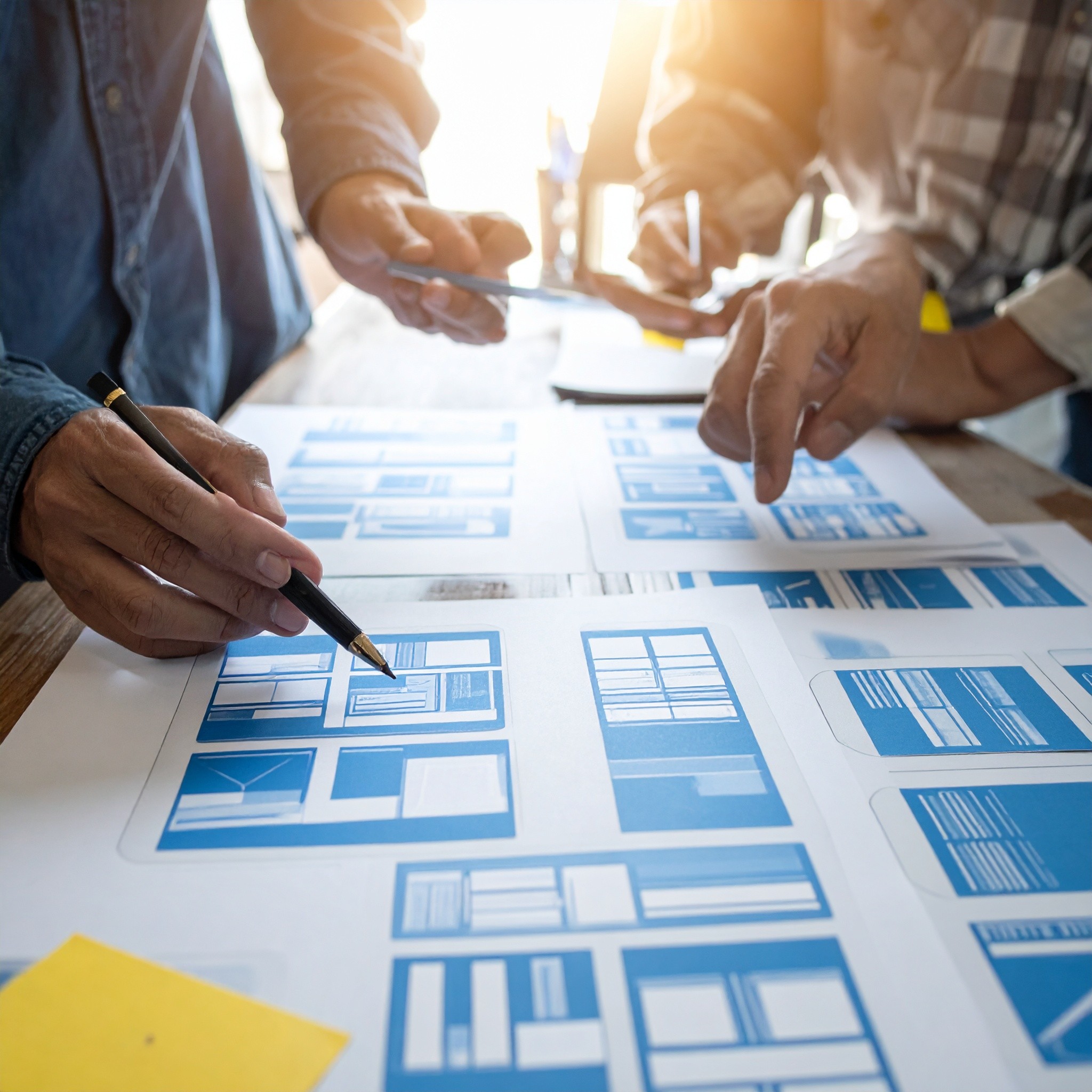
Prototyping & Testing

Objective

Observing real users interacting with prototypes to gather feedback

A\B testing

AB testing is quantitative research method used to compare two versions of a web page or app interface to determine which one performs better.

For AB testing, we create another version of one of the screens and ask specific questions about them.

A few key elements can be tested in AB testing:

  • Headlines and copy: Compare different wording to see which resonates more with users.

  • Call-to-action buttons: Test variations in size, color, text, and placement.

  • Layout and design: Experiment with different layouts, colors, images, and fonts.

  • Navigation elements: Test menu structures, labels, and placement for improved usability.


Exercise: A/B Testing Using Google Forms

STEP 1 – Define the test hypothesis

Before running an A/B test, define a clear hypothesis.

Example hypothesis:

“Version B of the homepage will generate a higher click intention than Version A.”

Explain to participants that without a hypothesis, there is no test — only opinions.

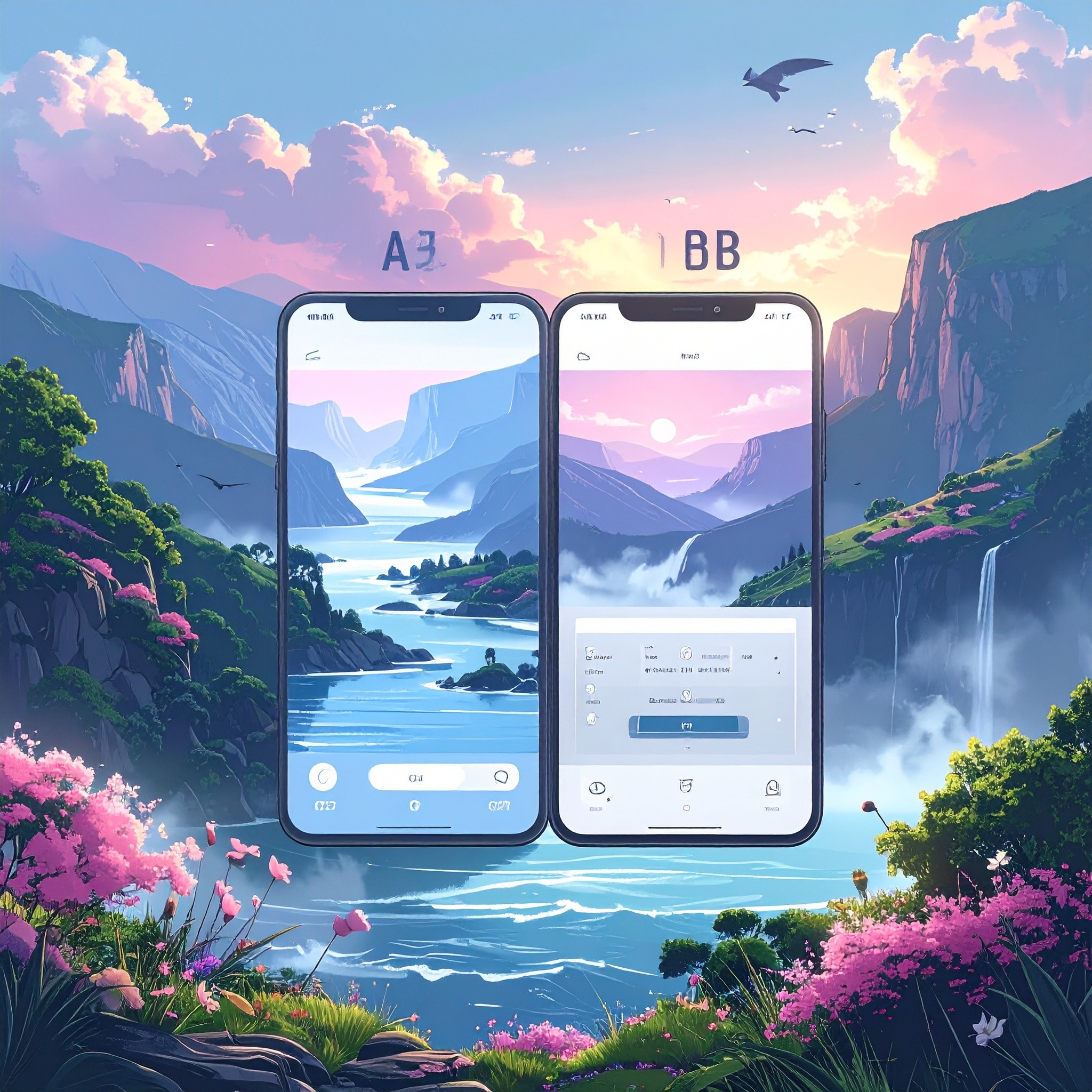
STEP 2 – Create the two design versions (A and B)

Provide:

  • Mockup images (from Figma, screenshots, or simple visuals)

  • Or short visual descriptions of each version

Each version should differ in only one element (e.g. button text).

STEP 3 – Create a Google Form

  1. Go to forms.google.com

  2. Click “+” (Blank form)

  3. Form title:
    A/B Test – App Homepage

  4. Description:

“This questionnaire aims to evaluate two homepage versions. There are no right or wrong answers.”

STEP 4 – User profile question (optional but recommended)

Question 1 – Type:

Multiple choice

Question:

How often do you use mobile applications?

Options:

  • Daily

  • A few times per week

  • Rarely

This helps contextualize the results.

STEP 5 – Present Version A

  1. Insert the image of Version A

  2. Add the following question below it:

Question:

How likely would you be to click the button on this page?

Question type:
Linear scale (1–5)

  • 1 – Very unlikely

  • 5 – Very likely

STEP 6 – Present Version B

Repeat exactly the same structure used for Version A:

  1. Insert the image of Version B

  2. Use the same question and scale

⚠️ Important to explain:

Questions must be identical to ensure a fair comparison.

STEP 7 – Final comparison question

Question:

Which version do you prefer?

Question type:
Multiple choice

  • Version A

  • Version B

STEP 8 – Share the test

  • Share the Google Form link

  • Participants can:

    • Answer the form themselves

    • Or share it with others (simulating real users)

Recommended minimum: 10–15 responses

STEP 9 – Analyze the results

  1. Go to the “Responses” tab

  2. Analyze:

    • Average click intention score (1–5)

    • Preference percentage between Version A and B

Discussion questions:

  • Which version performed better?

  • Was the hypothesis validated or rejected?

  • What UX decision would you make next?

STEP 10 – UX conclusion and decision

Each participant or group should complete the sentence:

“Based on the collected data, we chose Version ___ because…”

Reinforce that UX is not about personal taste, but about evidence-based decisions.

Other projects

Copyright 2024 by Callum Hayes | Design by Nuno Eusébio

Copyright 2024 by Callum Hayes | Design by Nuno Eusébio

Copyright 2024 by Callum Hayes | Design by Nuno Eusébio

Create a free website with Framer, the website builder loved by startups, designers and agencies.